This post originally published in the AppsFlyer blog.
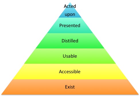
A couple of weeks ago Nir Rubinshtein and I presented AppsFlyer’s data architecture in a meetup ofBig Data & Data Science Israel. One of the concepts that I presented there, which is worth expanding upon is “Data’s Hierarchy of Needs:”
- Data should Exist
- Data should be Accessible
- Data should be Usable
- Data should be Distilled
- Data should be Presented
How can we make data “achieve its pinnacle of existence” and be acted upon. In other words, what are the areas that should be addressed when designing a data architecture if you want it to be complete and enable creating insights and value from the data you generate and collect.
If done properly, your users might just act upon the data you provide. This list might seem a little simplistic but it is not a prescription of what to do but rather a set of reminders of areas we need to cover and questions we need answered to properly create a data architecture.
Data Should Exist
Well, of course data should exist, and it probably does. You should ask yourself however, is if the data that exists is the right data? Does the retention policy you have service the business needs? Does the availability fit your needs? Do you have all the needed links (foreign keys) to other data so you’d be able to connect it later for analysis?
To make this more concrete, consider the following example: AppsFlyer accepts several types of events (launches, in-app events, etc.) which are tied to apps. Apps are connected to accounts (an account would have one or more applications, usually at least, an iOS app and an Android one). If we would save the accounts as the latest snapshot and an app changes ownership, the historical data before that change would be skewed. If we treat the accounts as a slowly changing dimension of the events, then we’d be able to handle the transition correctly. Note that we may still choose to provide the new owner the historic data but now it not the only option the system support and the decision can be based on the business needs.
Data Should Be Accessible
If data is written to disk it is accessible programmatically at least, however, there can be many levels of accessibility and we need to think about our end users needs and the level of access they’d require. At AppsFlyer, the data existence (mentioned above) is handled by processing all the messages that go through our queues using Kafka but that data is saved in sequence files and stored by event time. Most of our usage scenarios do have a time component but they are primarily handled by the app or account. Any processing that needs a specific account and would access the raw events would have to sift through tons of records (3.7+ billion a day at the time of this post) to find the few relevant ones. Thus, one basic move toward accessibility of data is to sort by apps so that queries will only need to access a small subset of the data and thus run much faster.
Then we need to consider the “hotness” of the data i.e. what response times we need and for which types of data. For instance, aggregations, such as retention reports need to be accessed online (so called “sub-second” response), latest counts need near real-time , explorations of data for new patterns can take hours etc. To enable support of these varied usage scenarios, we need to create multiple projections of our data, most likely using several different technologies. AppsFlyer stores raw data in sequence files, processed data in parquet files (accessible via Apache Spark), aggregations and recent data in columnar RDBMS and near real-time is stored in-memory.
The three different storage mechanisms I mentioned above (Parquet, columnar RDBMS and In-Memory Data Grid) used in AppsFlyer all have SQL access; this is not by chance. While we (the industry) went through a short period of NoSQL, SQL or almost-SQL is getting back to be the norm, even for semi-structured and poly-structured data. Providing an SQL interface to your data is another important aspect of data accessibility as it allows expanding the user base for the data beyond R&D. Again, this is important not just for your relational data…
Data Should Be Usable
What’s the difference between accessible data and usable data? For one there’s data cleansing. This is a no-brainer if you pull data from disparate systems but it is also needed if your source is a single system. Data cleansing is what traditional ETL is all about and the techniques still apply.
Another aspect of making data usable is enriching it or connecting it to additional data. Enriching can happen from internal sources like linking CRM data to the account info. This can also be facilitated by external sources as with getting the app category from the app store or getting device screen size from a device database.
Last but not least, is to consider legal and privacy aspects of the data. Before allowing access to the data you may need to mask sensitive information or remove privacy-related data (sometimes you shouldn’t even save it in the first place). At AppsFlyer we take this issue very seriously and make major efforts to comply when working with partners and clients to make sure privacy-related data is handled correctly. In fact, we are also undergoing independent SOC auditing to make sure we are compliant with the highest standards.
To summarize, to make the data usable you have to make sure it is correct, connect it to other data and you need to make sure that it is compliant with legal and privacy issues.
Data Should Be Distilled
Distilling insights is the reason we perform all the previous steps. Data in itself is of little use if it doesn’t help us make better decisions. There are multiple types of insights you can generate here beginning from the more traditional BI scenarios of slice and dice analytics going through real-time aggregations and trend analysis, ending in applying machine learning or “advanced analytics”. You can see one example of the type of insights that can be gleaned from our data by looking at theGaming Advertising Performance Index we recently published.
Data Should Be Presented
This point ties in nicely with the Gaming Advertising Performance Index example provided above. Getting insights is an important step, but if you fail to present them in a coherent and cohesive manner then the actual value users would be able to make of it is limited at best. Note that even if you use insights for making decisions (e.g. recommending a product to a user) you’d still need to present how well this decision is doing.
There are many issues that need to be dealt with from UX perspective both in how users interact with the data and how the data is presented. An example of the former is deciding on chart types for the data. A simple example for the latter is when presenting projected or inaccurate data it should be clear to the users that they are looking at approximations to prevent support calls on numbers not adding up.
Making sure all the areas discussed above are covered and handled properly is a lot of work but providing a solution that actually helps your users make better decisions is well worth it. The data’s hierarchy of needs is not a prescription of how to get there, it is merely a set of waypoints to help navigate toward this end goal. It helps me think holistically about AppsFlyer data needs and I hope following this post it would also help you.
For more information about our architecture, check out the presentation from the meetup:


